I talk to a lot of people about what people call “design”. There are developers who are great at design but many are worried about not having ‘design’ skills. But I don’t think design skills are nearly as important as usability skills. Shiny buttons, rounded corners, and lovely gradients are great, but if I am guessing on what the app is doing, we’re all doomed.
I use Skype. There I said it. I feel better.
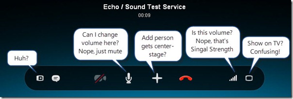
Skype had an update today and the calling UI had changed. The bar that gives you control of the call changed to this:
Pretty, sure…usable? Hardly. The move to these childish icons just made the experience worse. Some icons (the first and last ones in particular) are just not clear about what they do.
I was trying to do something that was easy before: change the volume. So let’s guess where the icon is…sounds easy. There is a microphone icon, maybe that’s it. Nope. Maybe the bars on the end, but that looks like WiFi…and yup. No volume. So where is it? Nowhere. The problem isn’t that they removed it (though I don’t understand it), it’s that the icons don’t make any sense.
Finally, the center of the bar is the “Add Person to Call” button. Really? That’s worth the prime real estate of center position? Nope…but, ok…you’re trying to promote that.
This post isn’t just to vilify Skype, but more importantly is that iconography is important but only if it aids in usability. If I have to hover to learn what each icon does, you’ve lost.


