Thanks for visiting my blog! See more about me here: About Me
One of the things that I’ve been spending a lot of time working with lately is the ability to be able to build cross-platform apps. While I spend a lot of time in the Microsoft space (especially Windows 8 and Windows Phone 8), I need to be able to create and deploy apps to iOS and Android platforms. I’ve decided to do a series on building one of these using Single Page Application for the web, then deploying it to devices via PhoneGap:
- Part 1: The App (this article)
- Part 2: Using PhoneGap APIs (upcoming)
- Part 3: Building with PhoneGap Build (upcoming)
- Part 4: Building for Windows 8 (upcoming)
Cross-Platform or Native
There are a number of solutions for cross platform apps (e.g. MonoTouch/Droid, et al.) The types of apps I am building are just consuming or displaying information from a standard web back-end (e.g. REST services). Because I typically need to build a responsive website for the solution as well, using a solution that could share some or all of it’s code with the website is a good match.
Using HTML5/JS/CSS to build apps isn’t perfect. Not all apps are a good candidate for this type of cross-device development, but I like to think that for many v1 apps, this is a laudable solution. In many cases, these apps are plenty functional for the life of the app, and in other cases it provides a fast-to-market solution so that a full native experience can be built after the app is initially launched and validates that it fills a market need (classic Minimum Viable Product strategy).
The App
The example is a pretty straightforward ASP.NET MVC4 site that uses JSON views to expose some example data. Currently the example is hosted in an Azure Web Site:
As an aside, I love this solution for hosting since I can just update the github repo and it gets built-deployed. See more about Azure Web Sites here.
The app is a simple Single Page Application (SPA). For those not that familiar with the Single Page Application design, it’s simply a way to create ‘in the browser’ applications. You probably already use some of these (e.g. Twitter, Facebook, etc.). The basic notion is that you can build a lot of functionality without making page requests. Oddly, SPA reminds me a lot of building Silverlight applications; or essentially “Services + Data Binding + Navigation”.
To be clear, my opinion is that Single Page Applications aren’t the right way to do web development in *many* cases. These are web apps not web sites.
By building the project as a SPA, we are benefiting from enabling an easier port to a device app. In many cases, you can re-use almost all the code (as we’ll see in the code examples in later parts of this series).
The Project
The ASP.NET MVC project is used as a shell for the SPA. I could have retro-fitted the SPA into Razor Views with controllers, but since the code is so client-driven I decided to keep the code simply in an .html file. So my three controllers end up being:
- HomeController: A catch-all that redirects to the site directory that contains my index.html page.
- GamesController: A Web API controller for exposing a set of Xbox games, including support for paging.
- GenresController: Another Web API controller that is used to expose the list of Genres.
The entire API is implemented as the two Web API controllers to expose the Games and Genres data. This data is not actually hosted in a database (or a NoSQL store) but is just a large hard-coded list of data. This was done to make the example as easy to pull and play with.
The actual site ends up being wholly hosed in a sub-directory called “Site”. This is significant because it contains the HTML, CSS, Images and JavaScript required to run the site. This isn’t a best practice, but simply helps us re-use these assets later when we want to build the device apps. By segmenting it into a separate directory, I can copy the whole thing later. This is *not* necessary.
Design
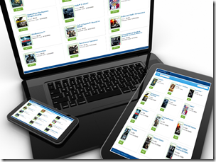
Key to building a site that can be used on devices (both phones and tablets) is to be able to deal with all the different form factors. While we could try and re-create the look/feel of the application by using different styles on different devices, this example purposely creates the same look/feel on the different devices. The purpose is to specifically keep our branding and look and feel similar as I’m seeing more of this approach as apps become less about adding functionality to users, but extensions of larger product approaches that include devices too.
To support the different device sides, the example using Twitter Bootstrap’s design foundation. Twitter Bootstrap includes (optionally) responsive design style sheets that the example uses. Because of this, the look and feel of the site will change based on the browser size (go ahead and resize the browser when you look at the example). Responsive design here is used specifically to allow for a better device story when the site is launched on devices; but this also allows us to deal with the different sized devices when we turn it into device apps later.
What I Used
While this article doesn’t dive into the specifics of how the site is built, I will talk about it at a high level. The code is out on GitHub so feel free to grab it and peruse it for more details. But to be complete, here are the client-side libraries I used:
- jQuery: The BCL for the web ;)
- Twitter Bootstrap: Layout and responsive design
- KnockoutJS: Data Binding
- AmplifyJS: Inter-page messaging (though this library does more than that)
- Sammy.js: Navigation/Routing
I also used the great site Initializr to create the initial boilerplate to produce an HTML5 Boilerplate page with Twitter Bootstrap enabled. I also used a design template from Bootswitch to change the basic Twitter Bootstrap look and feel.
Summary
With the basic web site created, we can be ready to start working with PhoneGap to add device functionality. That’s what you’ll see in the next part to this series.
